
Seymour Chwast is an American graphic designer. Known especially for his commercial work, he has a very distinct childlike aesthetic. In 1954, he founded Push Pin Studios with two other well-known designers. Looking at his work, prints priced at $100s of dollars, they are caricatures, satires, and cartoon looking designs. Push Pin’s “passion for historical design movements and helped revolutionized the way people look at design.” (http://www.pushpininc.com/html/seymour.html)
His body of work varies from print work, identities and packaging. The packaging

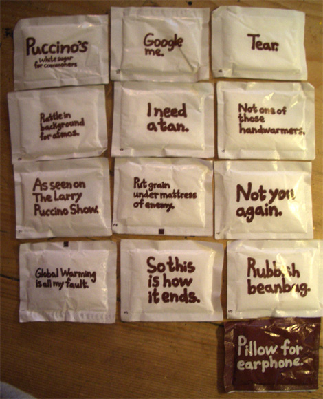
projects vary from ice-cream packaging to McDonald’s Happy Meals, to German glassware. Jerome Snyder, another contemporary artist, wrote “Chwast is fundamentally a humorist. His humor is dry, ironic, and only rarely sardonic. The play on images is witty, not flamboyant, taking off on human foibles or meanness in a seemingly deadpan banality that is, despite its first-glance ingenuousness, rich in veins of sophistication and subtlety.” Steve Heller, a collaborator on Chwast’s book projects said, “What I admire most is his subversive side. I mean the Chwast whose wily satire is a translation of his heartfelt social and political commitment into an accessible, comical yet acerbic graphic language”.

Both those acclaims really are telling on who Chwast is and how it reflects in his work. While Chwast is quoted as saying: “Don't ask me about humor! I know nothing about it.” Snyder and Heller see a sense of humor in Chwast.

When it comes to Chwast’s identities and logos, he uses shapes from type and typography to create figures and the rest of the design. One example of that is the Tracey Associates, both initials create a recognizable figure to present what that company does, which is health field communications.
It is not surprising to see that Chwast also designed children products. With already having a cartoon, bright and friendly color palette, Chwast’s work for children product is not a stretch. He illustrated books and board games.
 For one book cover, he used the main character as part of the typography. That book is the “Ode to Humpty Dumpty”. He uses Humpty, a large egg, to be the “o” in Ode.
His poster art, in my opinion is the most interesting. He plays with lines. The most impressive is entitled “Strike”. It’s a baseball player wrapped up in the path of a stray baseball. The batter’s arms are not clearly defined except by the yellow line that follows the ball. Without clear definition of any of the figures, it is a still clear at what the image is. The colors are also wonderful. The yellow draws attention to the image and provides a movement and a maze-like illusion. The rest of the colors are dulled down, even the black is a gray.

“Design Talk” was made in 1995. It uses lines varying in different thickness. The colors are bright and big. The talk stands out because it is smaller and provides a diversion from the slow paced reading that the spread out “design”. Another favorite is the “Earth Day’95”. It is peering into a future where the Earth has become unfriendly to humans. Chwast depicted a world where gasmasks are necessary and yet we still focus on shaving and hygiene. Granted, this work is depicted a pretty doomed future. Chwast predicted the world’s end in 1995.
His poster art and illustrations can be linked to the beginning of pop art. His favorite building was the Chrysler Building. You can see the influences of Art Deco mixed with his abstract and conceptual illustrations. It was moving away from the nostalgic kind of design of the Norman Rockwell period.
 Besides a product, identity and print designer, Chwast also is a type designer. He created a font in in1981 called Chwast Buffalo. It is mixes both sans serif with serif. There are a few others that are psychedelic. My favorite is the Weedy Beasties. Each letter has a face on it including a mouth made up of lined up squares, and at least one circle for an eye.
According to linotype.com, between 1948 and 1951, he studied at the Cooper Union. In 1954, he opened up the Push Pin Studio in New York. In 1955 to 1981, he became the art director of the “Push Pin Graphic”, an in-house magazine. From all the hard work he was elected into the New York Art Directors Hall of Fame. And finally, in 1975, he became a teacher at the School of Visual Arts in New York and the Cooper Union in New York.
His hard work and talent has paid off and been honored. He was awarded the Saint Gaudens Award from the Cooper Union School of Art in 1972. In 1983, he was indoctrinated into the Art Directors Hall of Fame. He won the Gold Medal at the American Institute of Graphic Arts in 1985. In 1992, he became the Honorary Doctorate from the Parson’s School of Design.
His work, even with today’s technology and graphics programs is still original and unrepeatable. It was the mind and the idea that’s that Chwast brought to his work that made graphic design what it was today.


